

A brand of their own
NUTRICON has spent years in wholesale. RASIVA, its own retail product, needed more than a logo: an identity that works on paper, packaging, and screen alike.

Hand, drop, leaf
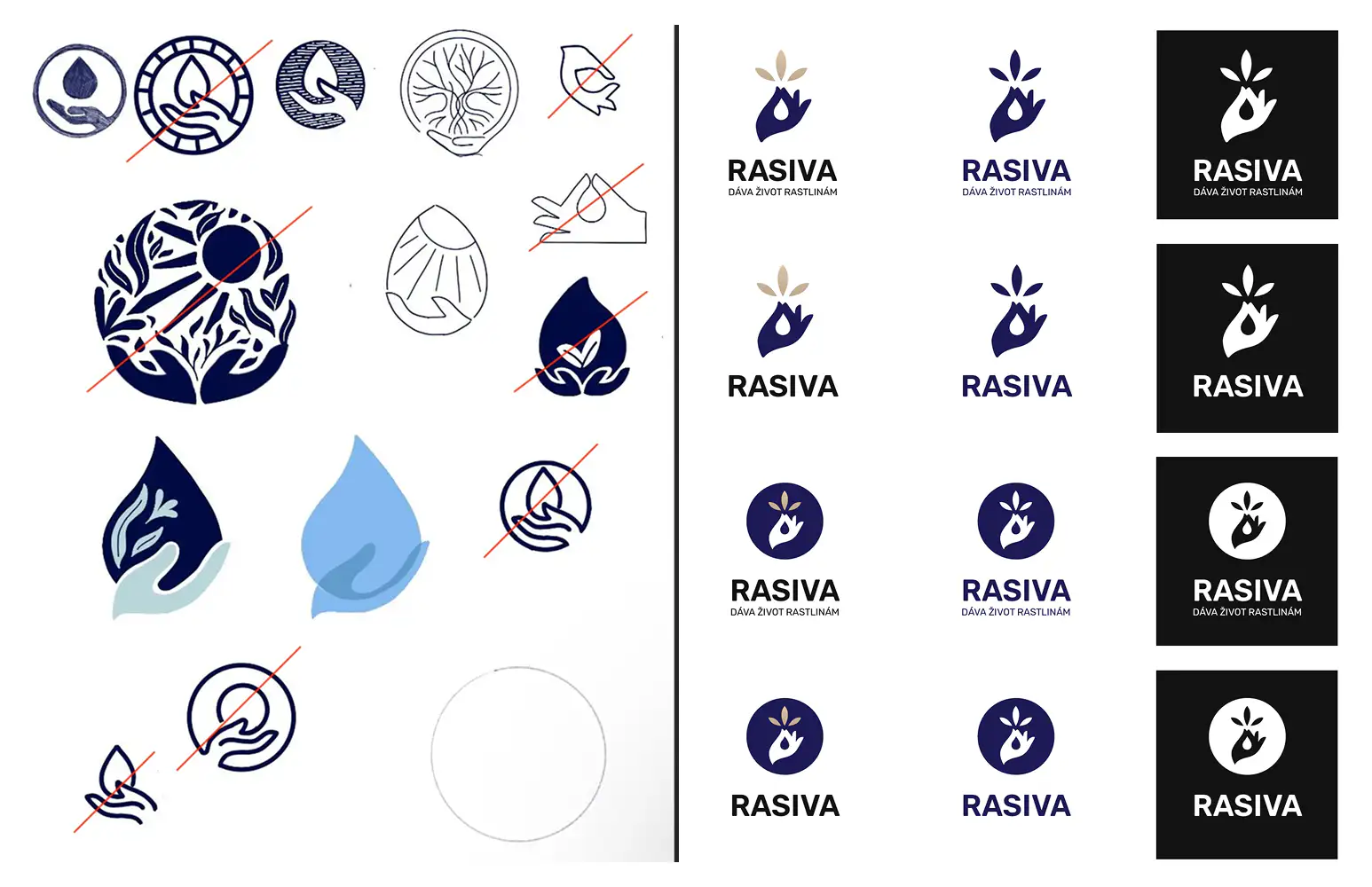
The mark was sketched by hand and redrawn until it carried the whole story: a hand offering a drop of nutrition, with new leaves growing out of it.
From sketch to shelf
RASIVA is liquid nutrition for plants: formulations that help them grow stronger and stay healthier. Behind the brand is NUTRICON, a company that has spent years in wholesale; RASIVA is the product it sells under its own name. Wholesale runs on relationships and price lists. Retail runs on trust at first glance. So before the first label could be printed, the whole brand had to exist.
We worked with the founder from the earliest conversations about direction: what the brand should promise, how it should behave, and where it could afford to be different. That last question shaped the identity’s defining choice. Plant care shelves default to green; RASIVA wears deep indigo and warm beige instead, and looks like nothing else standing next to it. The mark took the honest route to get there: pages of pencil sketches, most of them crossed out, until what remained was a hand offering a drop of nutrition with new leaves growing from it. Beneath the wordmark sits the slogan we helped shape: “Dáva život rastlinám”. It gives life to plants.
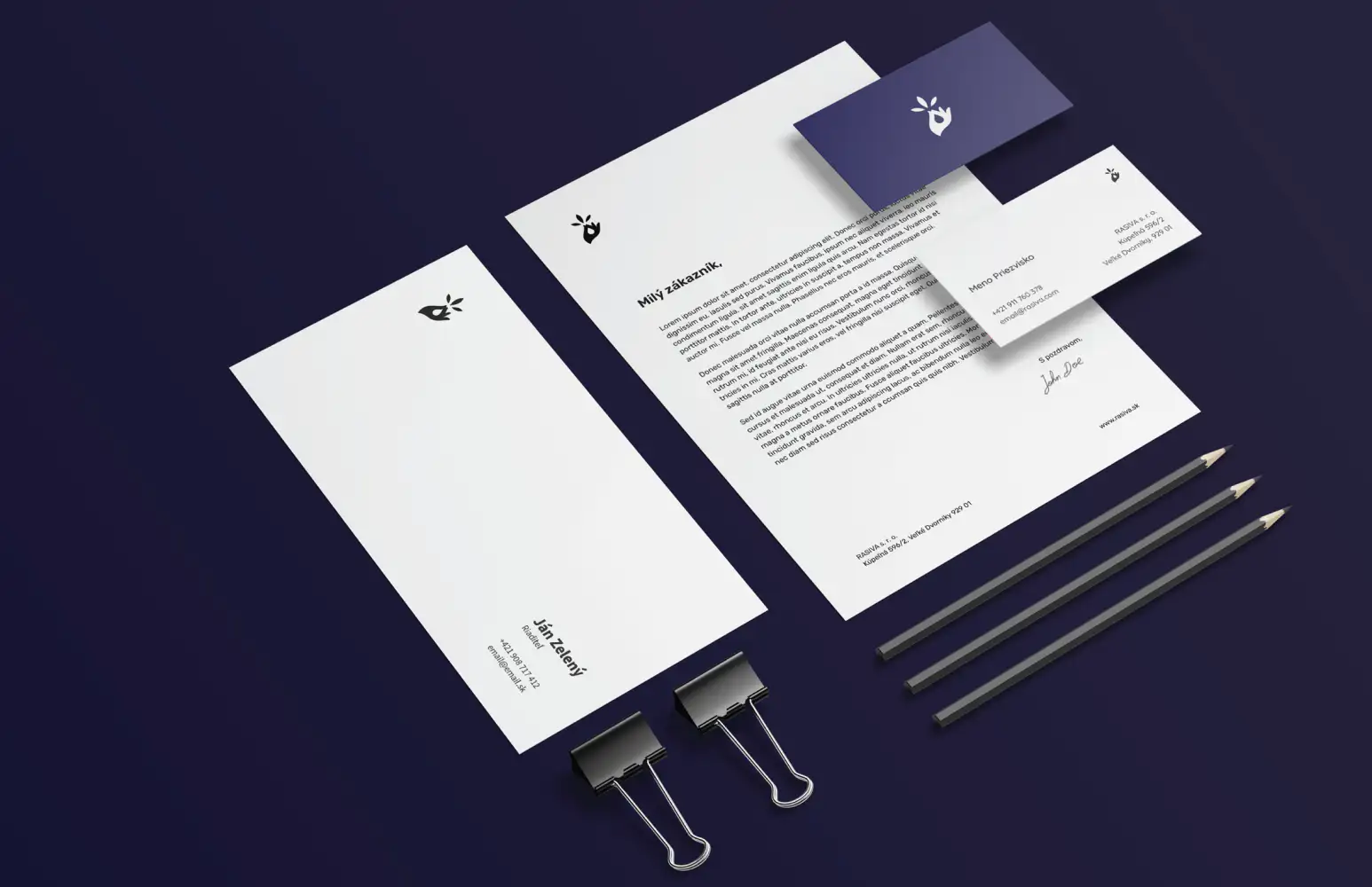
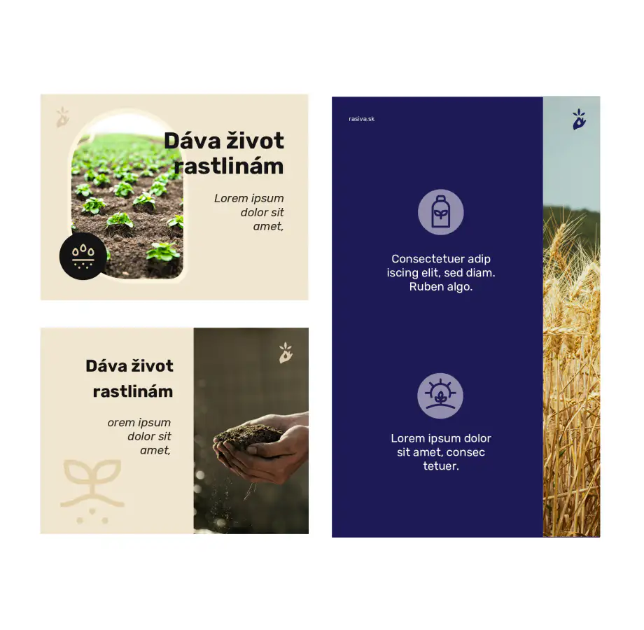
From there we built the complete identity: a logo system with badge and single-color variants, typography, color, and a set of custom icons drawn for the product world (drops, shields, pests — the things a nutrition label actually has to say), all documented in a brand book any printer or partner can pick up and follow. We also designed the print set, business cards, letterheads, envelopes, plus templates for social posts and web banners, so the brand shows up consistently without a designer on staff.
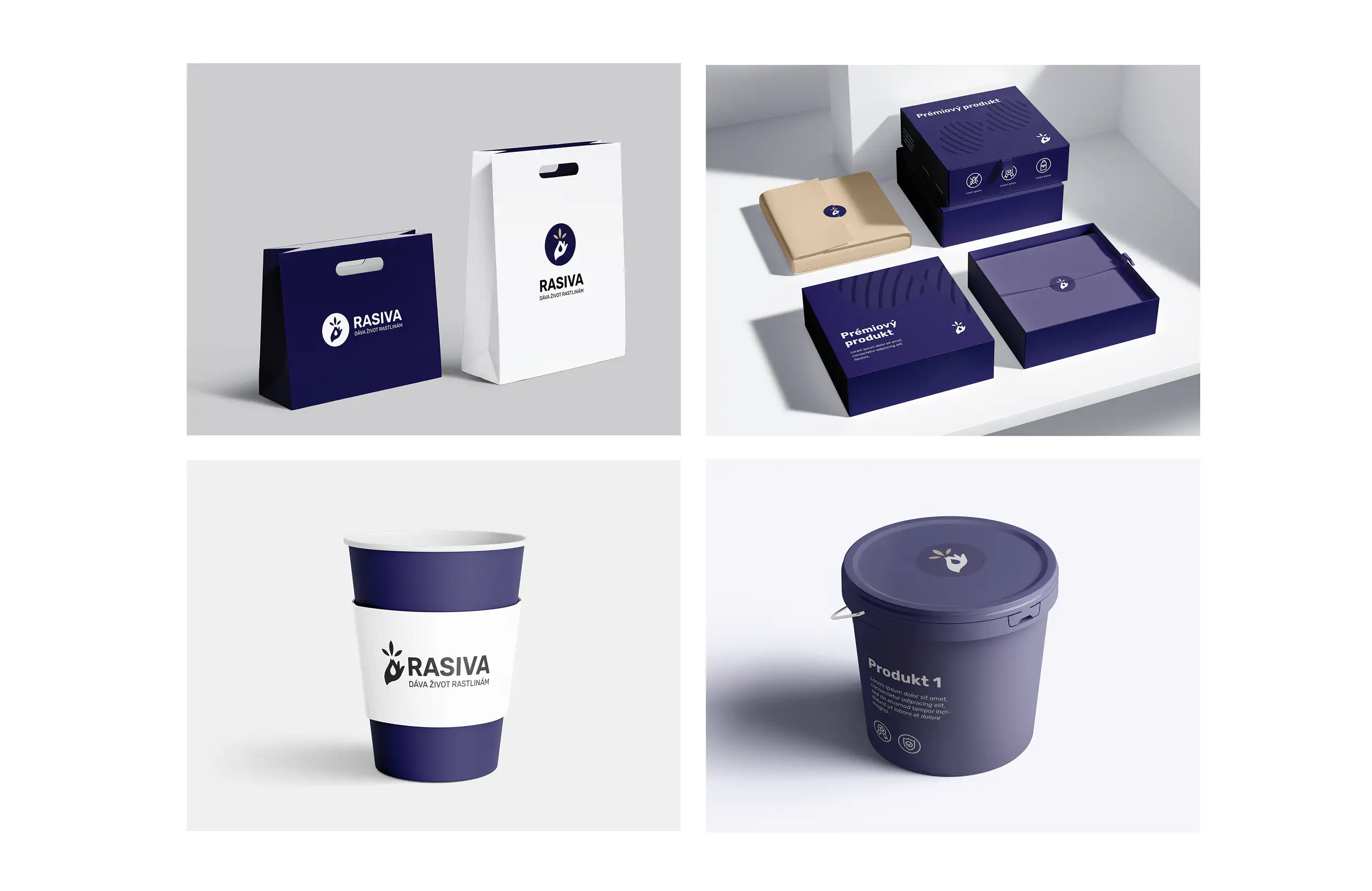
Packaging followed as the natural extension. We designed the product labels themselves: layout, hierarchy, and the unglamorous work of fitting mandatory legal copy, dosage instructions, and safety information onto a limited surface while keeping it readable. Those labels are on RASIVA’s manufactured products today.
RASIVA entered retail looking like it had been there for years: one mark, one voice, one system from business card to bucket. Everything matches because everything was drawn by the same hand.